Palm Trees and a Tropical Breeze 2026
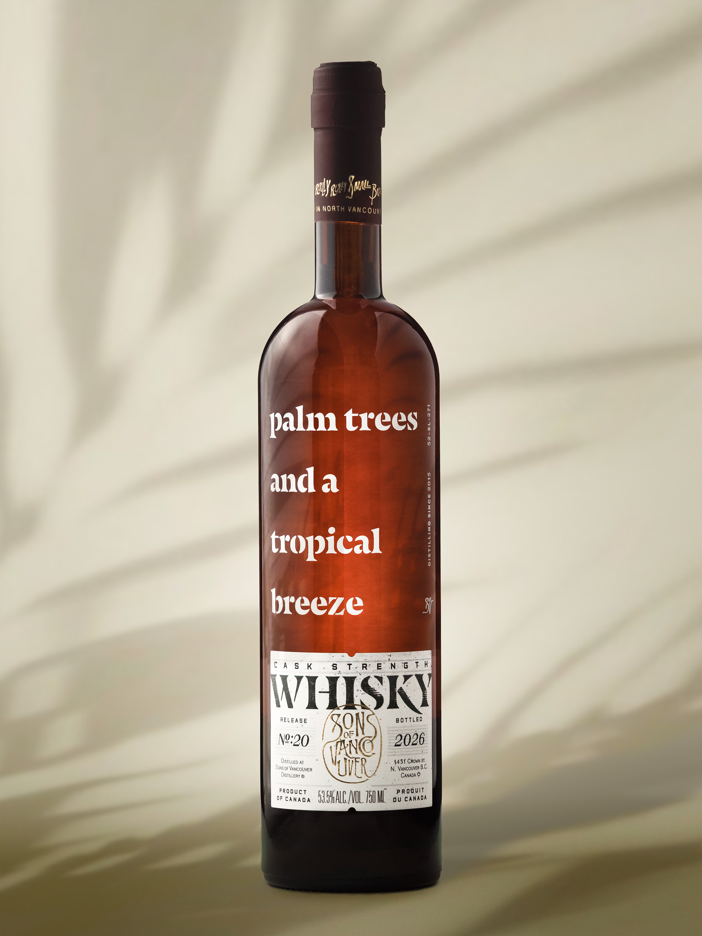
Sons of Vancouver names its releases after what’s in the glass. Palm Trees and a Tropical Breeze is a 100% rye that was finished in rum casks. The name tells you where the cask has been and roughly what you’re about to taste. It’s the same idea the Scotch Malt Whisky Society uses for its bottlings. Skip the technical label on the front and describe the experience instead.
This is the fourth time the whisky has come around, and I’ve photographed three of the four. It’s also become the release where I let myself try something different with the look.
The whisky
Release #20 is a 100% rye, aged three to five years in ex-bourbon and new American oak before resting in Colombian rum casks. The nose is overripe pineapple and banana bread. On the palate it moves to Demerara sugar and dark chocolate, with baking spice that hangs around for a while. The back label says it “makes you want to quit your job and float away into island bliss,” which is a big promise for a rye. The rum cask does a lot of the heavy lifting.
It’s also the first Palm Trees release in Sons of Vancouver’s new dark brown bottle. Clear glass is easy to light. Light goes in one side and the whole bottle glows. Dark brown glass swallows most of it, so before I built anything I knew the real job was getting light through the bottle without losing its shape.
The look
Most Sons of Vancouver releases I shoot the same way: a simple wood backdrop with a mirror as the base. It’s clean, it’s consistent, and it lets the bottle do the talking. Palm Trees has always been the exception, the one release where I lean into the tropics.
For the first two I photographed, that meant going literal. Sand on the base, a blue sky behind, palm fronds in frame. It worked, but this time I wanted the same feeling with less in it. Cleaner, more minimal, a bit more graphic.
The push came from a recent Macallan release. I liked how clean and quiet it was, and wanted that restraint at a warmer, calmer temperature. The idea in one line: a rum cask whisky with a calm, warm, tropical feel. Less beach party, more the slow afternoon of a holiday where nobody is checking the time.
That warmth does a job. If the photo puts you somewhere warm, the pineapple and Demerara make more sense once you get to the glass.
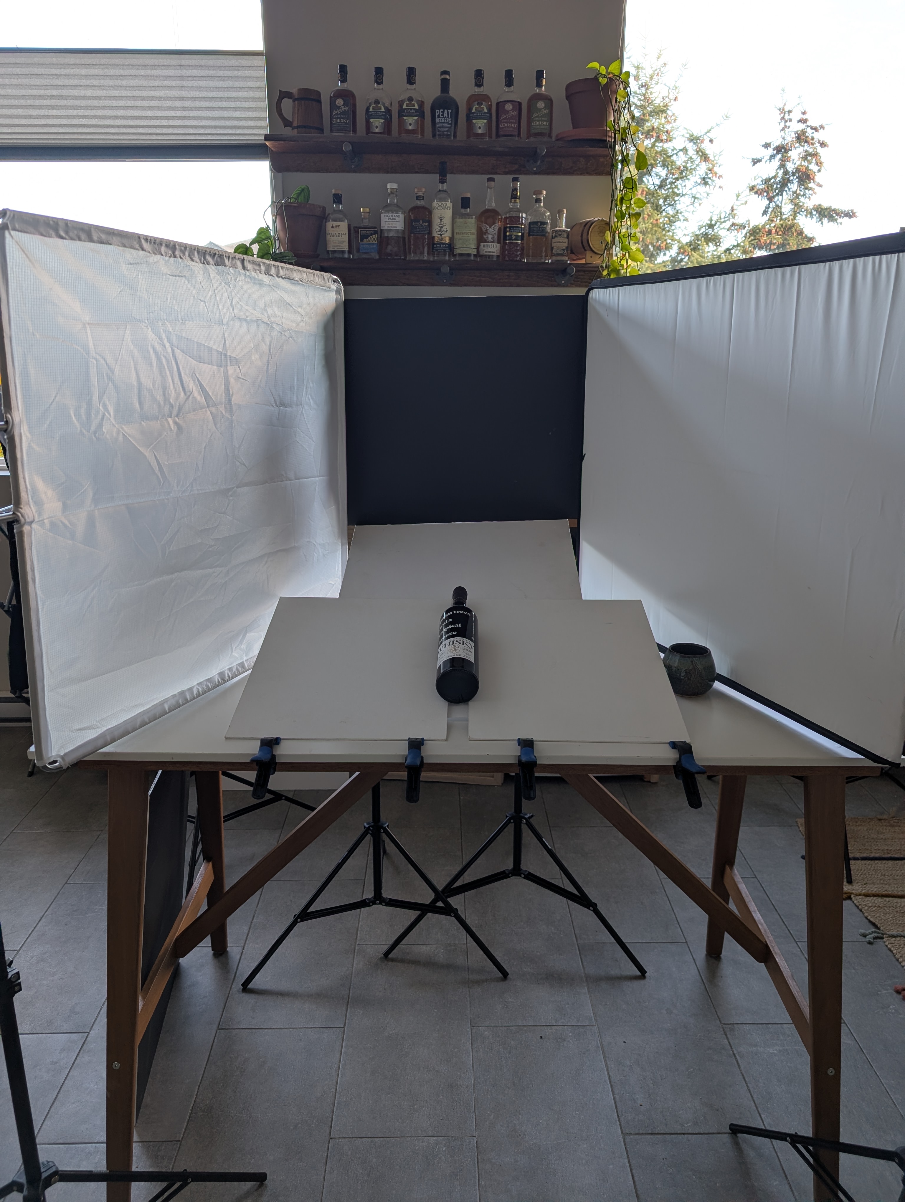
The set was almost nothing. White foam core for the backdrop, white canvas boards for the base. That’s the full prop list.
The shoot
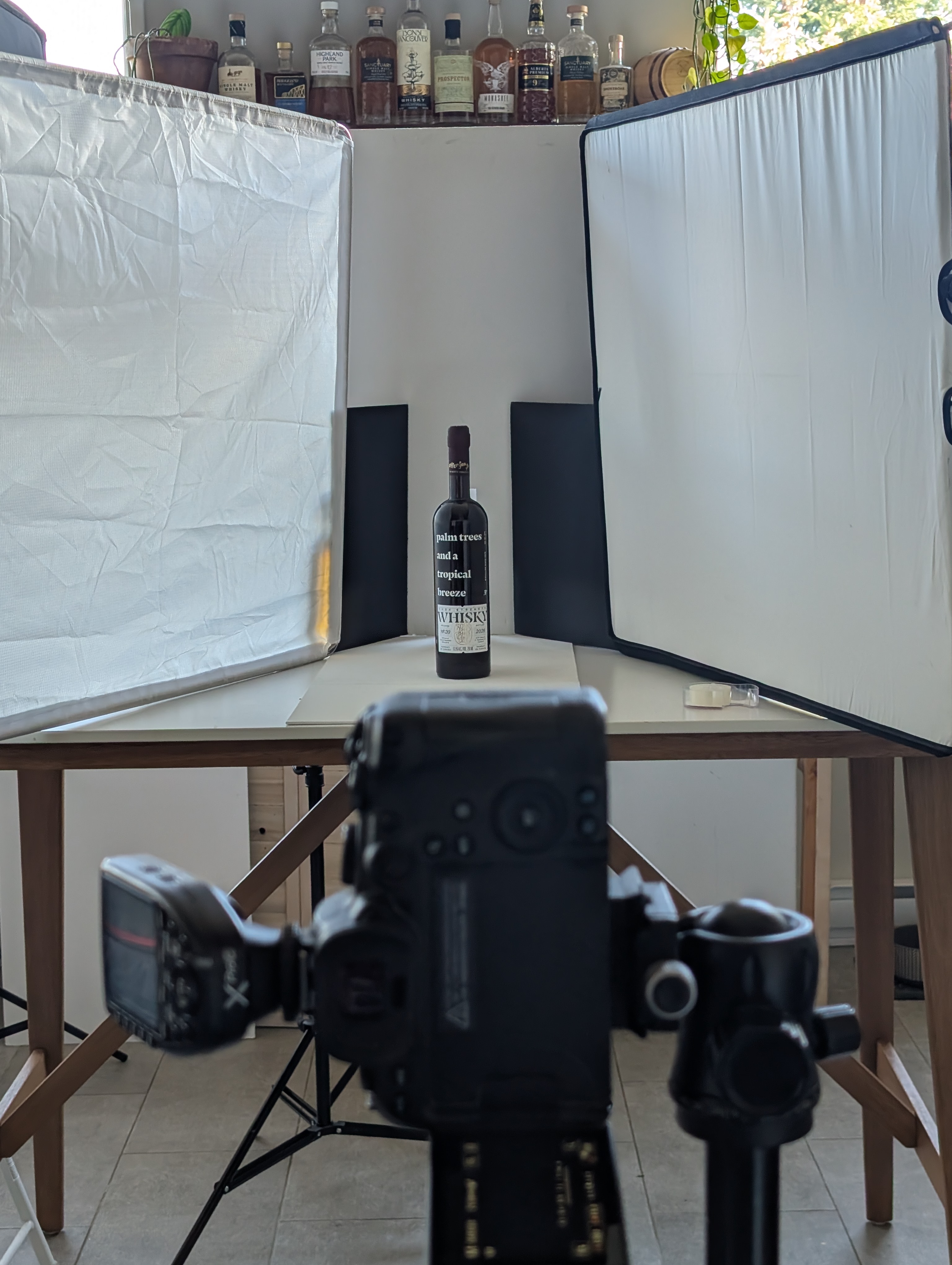
I built it in my kitchen, about 45 minutes from empty counter to first frame.
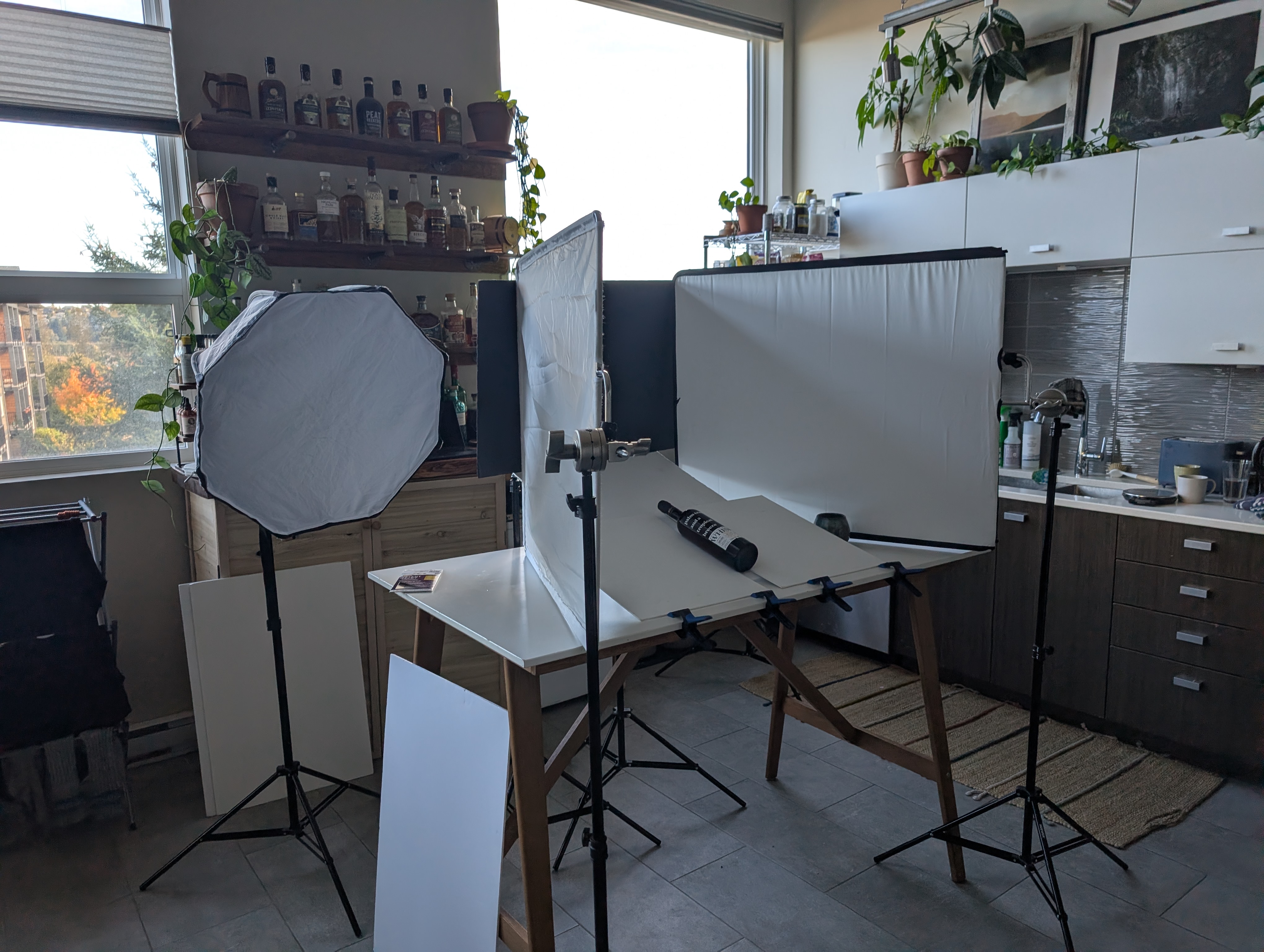
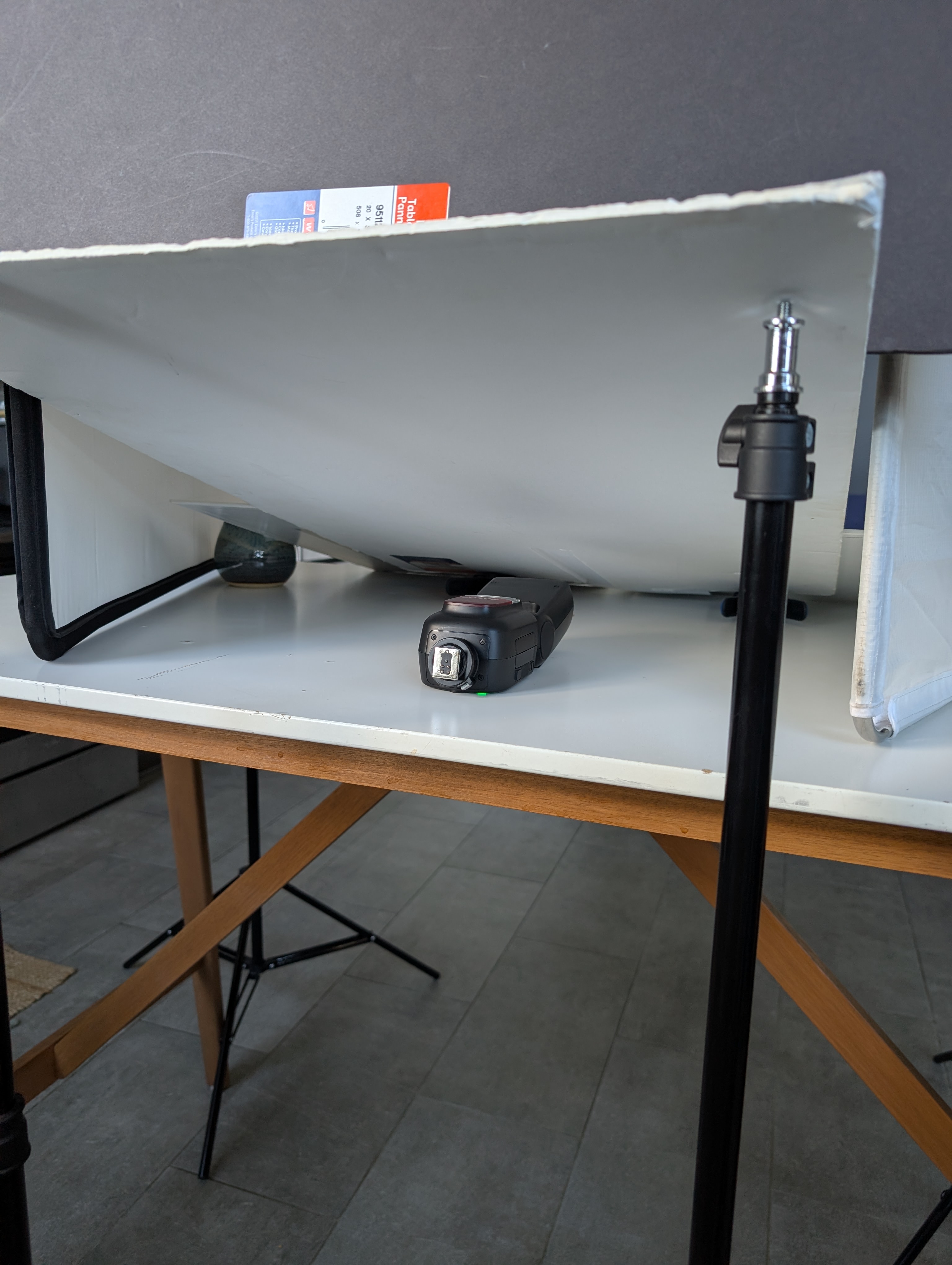
The angled shot was the tricky one. The idea was to lay the bottle down and have it glow, which means light coming through from behind and below. My first attempt was two white boards on the base with a small gap between them, so a light underneath could shine up through the slot. It worked, and the bottle lit up, but the gap threw ugly reflections across the glass.
So I stopped trying to lay it flat. Tilting the bottle only slightly let the light come through at a different angle, and it lit cleanly. It also pushed the air bubble up to the top of the bottle, which helped keep the label and naming clean without distractions.
The plan was to get everything in camera. That didn’t survive the day. To keep the edges of a dark bottle crisp, you need black cards behind it and to the sides, so the glass picks up black along its edges and holds its shape. Those cards were well into frame, and there was no way to light the background warm and clean while keeping them. I chose the bottle. The background would get built afterwards.
The post
That turned this into a different kind of image. The bottle is the only real thing in the final photographs. Everything around it was made in Photoshop.
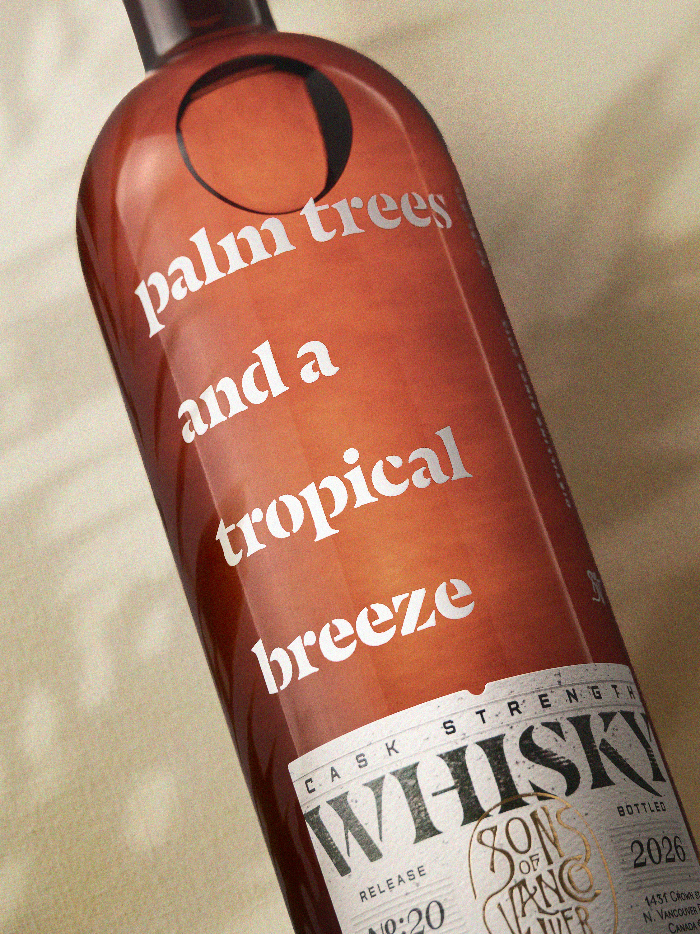
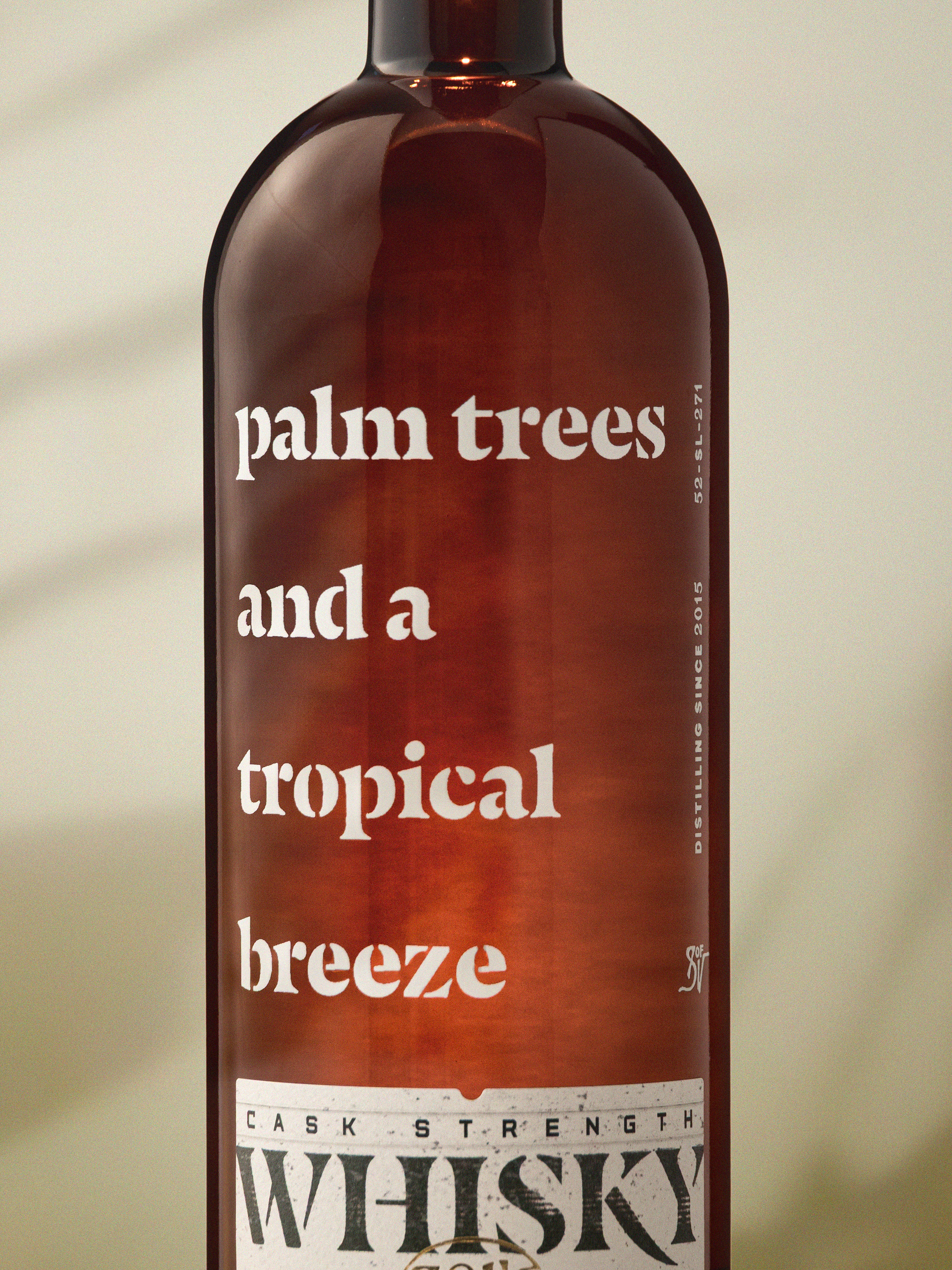
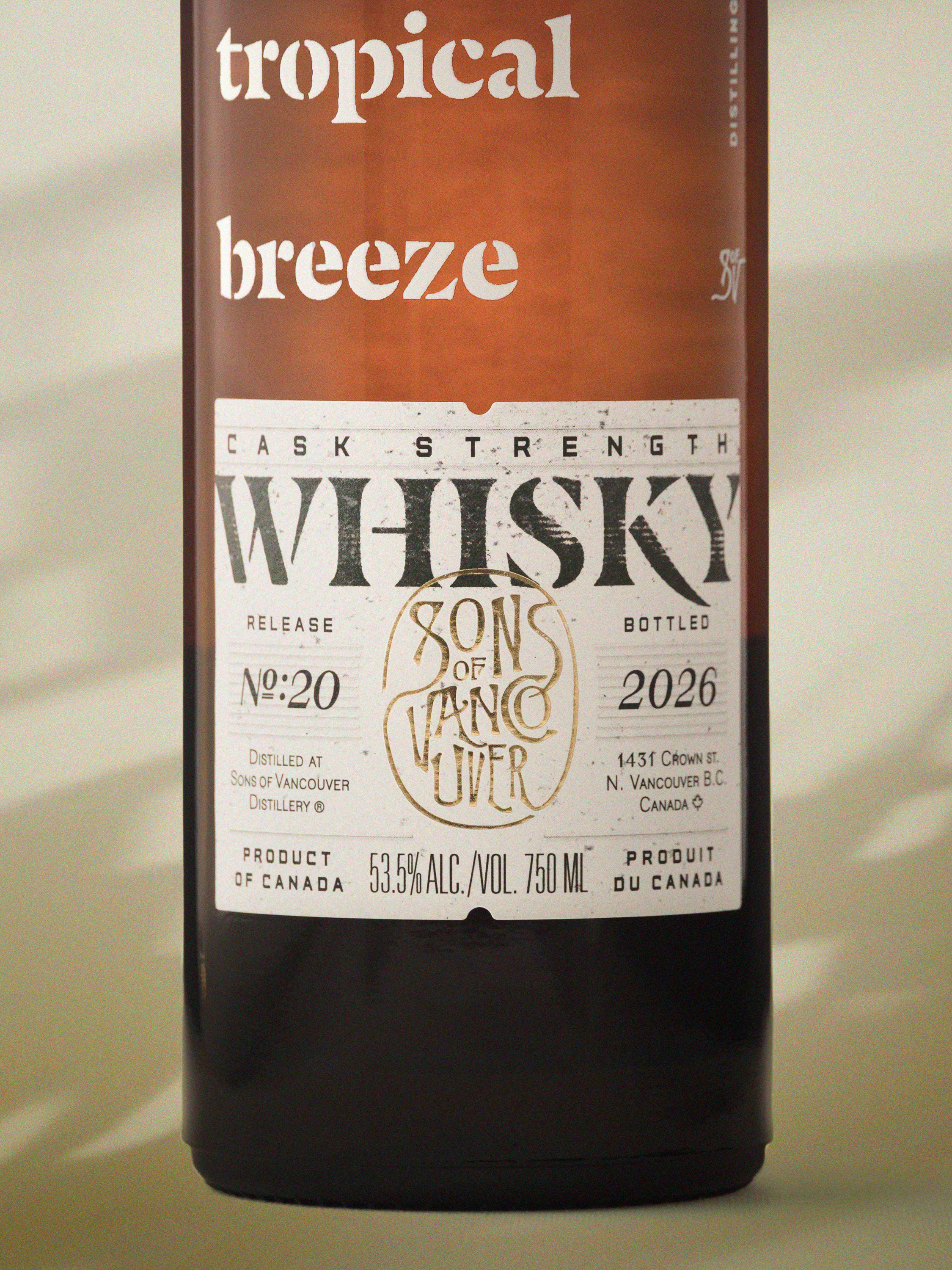
The base and backdrop are a single tan colour, shaped with curves and layer masks so they read as a floor curving up into a wall with light falling across it. Over that I added palm shadows and warped them so they bend from the base up onto the backdrop, the way a real shadow folds over a corner.
I also tried a fabric texture over the colour, set to soft light and warped to follow the same base-to-wall curve. It wasn’t bad. But the weave was too big, and at that scale it made the bottle look small. Matching its perspective to the bottle never quite worked either. I turned it off, preferred it, and left it off.
It sits closer to graphic design built around a photograph than a straight still life, and I’m happy with that. The brief was a feeling, not a location.
What I’d change
A third flash. With one more light I could cast real palm shadows on set, and the bottle would pick up actual palm reflections in its glass instead of only having them in the background. That’s the part I’d most like to get in camera next time.
Where they ended up
These are the marketing stills announcing the release across Sons of Vancouver’s email and social channels.
- Client
- Sons of Vancouver Distillery, North Vancouver
- Release
- Palm Trees and a Tropical Breeze, Release #20
- Photography, lighting and retouching
- Adam Dewar
- Shot
- 10 October 2026, kitchen set